Television branding has come a long way since its inception, but in the early days, logos were not simply digital creations. They were physical objects—crafted by skilled hands, filmed in real time, and imbued with a dynamic energy that set the stage for the future of TV identity. These logos weren’t just static symbols; they were elaborate, carefully constructed physical representations that captivated audiences and defined the branding of major television networks. In this article, we’ll take a look at some of the most iconic physical TV logos ever created and explore the behind-the-scenes magic that brought them to life.
MGM’s Leo the Lion: The Pioneering Physical Logo (1916)
When we think of TV logos, one of the most iconic symbols that comes to mind is the roaring lion of MGM. This symbol has stood the test of time, evolving through the decades but maintaining its majestic presence since it first appeared in 1916. Leo the Lion’s original logo was a physical creation—an actual lion filmed for the opening of MGM movies. What began as a simple promotional idea turned into an enduring and beloved brand, one that spanned multiple generations.
Over the years, seven different lions have appeared as the face of MGM, each contributing their own personality to the brand. Leo’s roar became synonymous with the grandeur of Hollywood cinema, and his enduring presence in the opening credits of MGM films is an integral part of film history. The use of a real lion in the logo was groundbreaking for its time, setting a precedent for dynamic, animal-driven TV identities.
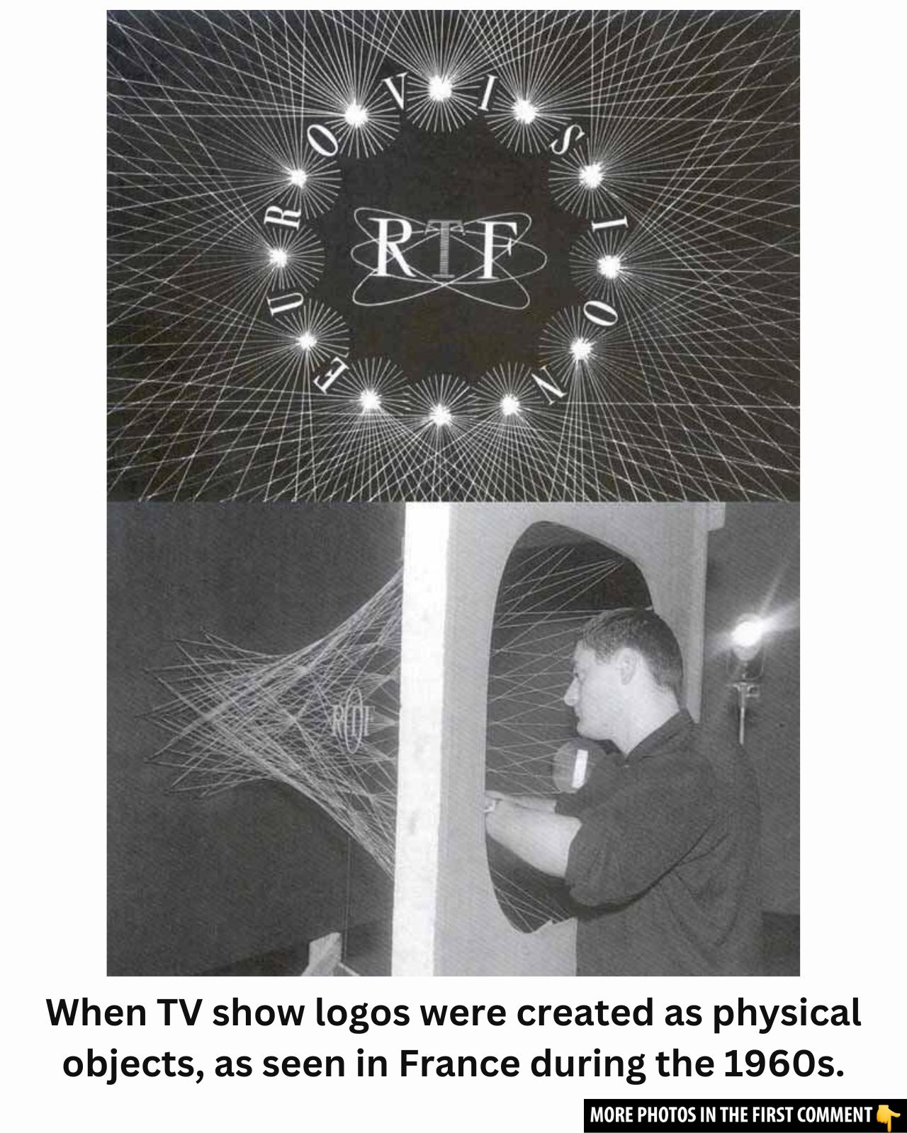
ORTF’s String Logo (1960s): Crafting a Shimmering Identity
Jumping into the 1960s, we arrive at a remarkable piece of TV history—the physical logo created for the Office de Radiodiffusion Télévision Française (ORTF). Unlike static logos we’re familiar with today, this logo was designed using an array of strings arranged to form an abstract shape that shimmered and shifted as the camera filmed it. The strings added a visual effect that could not be replicated with 2D graphic design at the time, providing a unique sparkle that made the logo stand out.
The creation process for the ORTF logo was entirely hands-on, and the strings provided an intriguing dynamic that reflected the experimental spirit of television in the 1960s. What’s fascinating is that this logo wasn’t simply static—it was filmed from different angles, allowing for a sense of movement that couldn’t be achieved using conventional design techniques. The result was a stunning, dynamic logo that caught the eye and set the bar for future TV branding efforts.
You can watch the recreation of this unique logo’s design in the ESC 1962 – French comments (RTF) video below:
The BBC’s Globe and Mirror Logo (1981-1985): A Mechanical Marvel
In 1981, the BBC introduced one of its most famous logos, featuring a rotating globe captured in a mirrored effect. This physical logo wasn’t computer-generated or animated but was filmed using a special device called the “Noddy camera system,” which allowed the globe to rotate in front of a panoramic mirror. This process provided the illusion of movement and gave the BBC’s logo an elegance that matched the station’s esteemed reputation.
The live-action filming of this iconic logo was truly ahead of its time. After the footage was captured, it was adjusted using contrast techniques to create the perfect color, adding an ethereal quality to the logo. This was a brilliant example of how mechanical ingenuity could be used to create logos that were not only beautiful but also a visual symbol of the station’s reach and global influence.
You can explore the process behind this iconic logo’s creation in the BBC1 Mirror Globe Recreation video below:
HBO’s 1983 Intro: A Surprising Use of Physical Effects
When we think of HBO’s brand today, we likely picture their iconic animated intros and slick digital designs. However, in 1983, HBO took an entirely different approach. The network’s intro sequence, while giving the appearance of being animated or digitally created, was actually built using physical effects. This was a stunning achievement in practical filmmaking, combining models, lighting effects, and a carefully orchestrated filming process to create the signature look that viewers came to associate with the premium channel.
The 1983 HBO intro showcased the magic of physical effects, reminding us of the craft and artistry involved in creating TV identities. By employing techniques like forced perspective, miniatures, and meticulously timed lighting, HBO achieved a logo that felt modern and futuristic, despite the fact that it was created entirely with practical methods.
To see how HBO pulled off this impressive intro, check out the HBO Intro – Behind the Scenes video below:
The Evolution of TV Logos: Transitioning from Physical to Digital
As digital technology advanced, the world of television logos shifted. The early use of physical objects, models, and live-action filming gave way to the digital age, where animation, graphic design software, and 3D rendering tools revolutionized the way TV logos were created. But even as we entered the era of computer-generated imagery, the influence of those physical logos remained.
In the transition from physical to digital, the essence of what made TV logos so iconic—simplicity, symbolism, and brand recognition—was preserved. Today, TV networks use a combination of digital design and virtual elements to craft logos that convey their identity quickly and effectively. However, the legacy of physical TV logos like MGM’s roaring lion, the BBC’s globe, and HBO’s mechanical intro can still be felt in the digital designs that dominate the media landscape.
Conclusion: The Lasting Impact of Physical TV Logos
The world of television branding owes a great deal to the physical logos that were created in the early years of the medium. These logos were not just static images but dynamic symbols that involved skillful craftsmanship, ingenuity, and a deep understanding of the medium. As technology advanced, the methods of logo creation evolved, but the legacy of physical logos remains an integral part of television history.
From the iconic roar of MGM’s lion to the shimmering strings of the ORTF logo and the rotating globe of the BBC, these logos helped shape the identities of major television networks and film studios. They set the stage for the modern logos we see today, reminding us of the artistry that went into building the brands that have entertained and informed audiences for generations